
Until recently, marketers have had a lock on several persuasive design techniques, often referred to as conversion centered design (CCD). Usually found on landing and order pages, these techniques employ psychological principles that advertisers have relied upon for decades.
| Article written by Sara Hov, UX Content Strategist
Now, savvy UX designers are starting to apply some of these proven behavioral influences on regular site pages, with powerful results. Here’s the lowdown on conversion centered design and how you can make it work for you.
What is Conversion?
In marketing, conversion usually refers to getting site visitors to become paying customers. In design, conversion can mean getting users to take any preferred action, whether or not money is involved. This could mean subscribing to an email list, signing up for a free software trial, or just clicking through to another page. Conversion is simply the rate at which users follow your site or product’s call to action.
Whenever you’re talking about conversion, you need to be familiar with another marketing concept: the funnel. Hopefully you’ve come to terms with the fact that not everyone who visits your site or hears about your product is going to say yes.
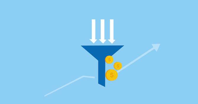
The funnel is a metaphor for that large group of visitors being narrowed down when they convert to paying customers.
Why Use CCD
If that process sounds a little familiar, good! Just as marketers create paths for converting new customers, UX designers map out user flows. Whether you call it a funnel or a journey map, the end goal is the same — getting people to do something.
As a UX designer, you already spend a lot of time learning who your users are and thinking through the ways they use your site. In the end, however, unless they follow through on whatever it is you’d like them to do, your product will fail. That’s where conversion centered design can make a difference.
For users, CCD can save time and energy by providing focus. For UXers, that means stronger results. Because CCD requires a specific call to action, you’ll have to prioritize what you most want users to do. And because CCD involves making that call to action stand out, it will be pretty clear how well it’s working.
Not only does this approach drive measurable progress toward business goals, it gives you another tool to guide your decisions in the form of quantitative data.
Caveat No. 1: It’s not always easy to figure out which data points are the best indicators of results.
How Does CCD Work?
At the core of marketing and conversion centered design is A/B testing. For years, marketers have tested new ads against the status quo, called the control. The control stays in use until a new ad beats it by achieving — you guessed it — higher conversion. If you’re not already using A/B testing to evaluate your site designs, it can be extremely effective, not least internally. Running a test makes it a lot easier to bring stakeholders to consensus.
Just as in science class, the best A/B tests keep everything the same except for the one variable being tested. Don’t worry if you can’t control for every single thing, however; you can still learn a lot from A/B testing even if your product or your timeline don’t allow you to set up perfect tests.
Caveat No. 2: You do have to be sure you’re tracking your tests and reading the data correctly, which is often much less straightforward than it sounds. See the thousands of results for “Google Analytics explained” if you don’t believe me.
Now that you know some basics, what are these magically effective design techniques that marketers have discovered? Here are the ones that are most portable to UX design.
Simplicity
The less clutter in your design, the easier it is for the user to know what to do. Are you able to take a seemingly long process and break it down step by step? Or even remove features/options to reduce confusion for users?
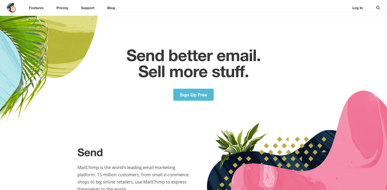
Mailchimp’s homepage is a demonstration of simplicity at work, using a combination of generous white space, rigid word count and the highly visible call to action (“sign up free”).
Encapsulation
To make your call to action stand out, enclose it in a rectangle.
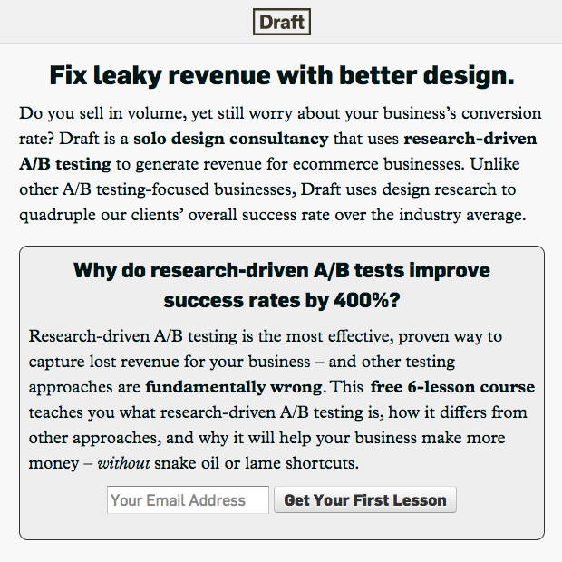
In the above example from Nick Disabato’s website, the main call to action is framed within a box. This makes the most important element on the page it more visible, whether or not it’s a button.
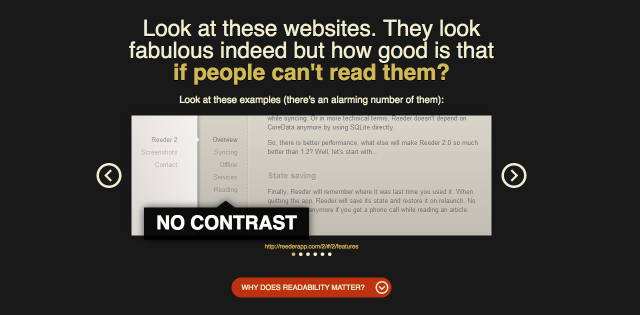
Contrast
The call to action should be in clear contrast to the rest of the page. Color is a great way to build contrast — make the call to action a bright color that stands out from the rest of the palette. You can also play around with the light and dark contrast on the page, in your background color and even in a background image.
Urgency
Deadlines work. Nudge your users into action by reminding them what they’ll gain by acting quickly. Stay away from hackneyed sales cliches. Instead, offer clear value for fast action.
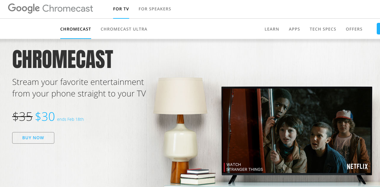
In the example below for Chromecast’s ecommerce page, Google creates urgency by specifying the end date of its latest promotion.
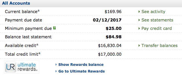
The opposite approach can work, too, as in the minimum payment versus higher payment amount tables on credit card statements.
Newness
Pique your users’ curiosity by using words like “latest”, “new”, and “today.” Make them excited to take the next step.
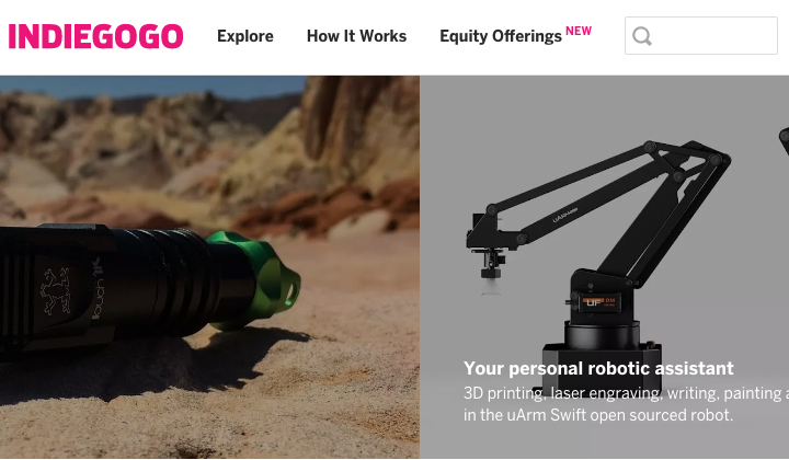
In the above example, Indiegogo promotes its new feature with a literal “new” right next to equity offerings on its homepage.
The Bottom Line
If you think conversion centered design is just for marketing, think again. Marketers return to the same powerful psychological principles for a reason, and smart UX designers can borrow and adapt their techniques to boost usability and achieve business goals, even if they have nothing to do with money. And because CCD is rooted in simplicity, it’s easy to give it a shot.
Which CCD techniques will you try first?
Further reading: