
In a competitive UX job market, those who pay attention to the details and ask the high-level questions stand out. Questions like:
Do our designs solve problems in the best possible way?
Here’s a quick and effective framework to answer that very question:
Know Your Usability Laws + Test Your Designs
It sounds simple, but you’d be surprised how often the classic UX laws are ignored in digital design and beyond. In fact, you may be educating many a hiring manager about the UX laws you’ll be learning today.
The majority of this post will cover the top 3 UX laws that UX Beginners can benefit from – and funny ways to remember these laws easily.
Then we wrap up with how these laws, combined with testing, leads to more powerful designs.
LEARNING THE UX LAWS

Disclaimer: there is a ton of research that comes with each law, but for the purpose of the article I try to make each one of these laws actionable and easy to remember for the beginning UX designer.
I certainly don’t cover all the bases here; there are many variations & challenges to the law. Google will pick you up should I fail to give good explanations :)
Hick-Hyman Law (aka “Hick’s Law”)
Definition:
Increasing the number of choices will increase decision time. [Wikipedia link] [Usability.gov link]
Sounds like common sense: more choices leads to more time evaluating which choice to make. The terms “analysis paralysis” or “death by numbers” may come to mind – having too many things to choose from can overwhelm users, sometimes making them quit the task at hand completely.
Good Application of Hick’s Law:
In ‘N Out Menu: This simple menu has worked for over half a century. Even indecisive eaters will find it a challenge to take more than 1 minute to decide what to eat.

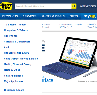
For a chain the size of Best Buy, its website has a surprisingly simple and streamlined menu.
Bad application of Hick’s Law:
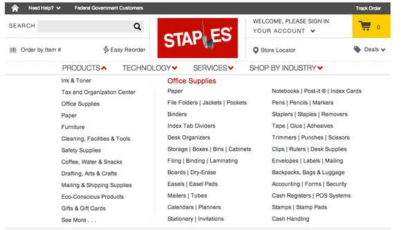
What’s going on? Customers (especially new ones) are inundated with options.

Unlike Best Buy’s Menu, Staples’ “mega menu” can be quite overwhelming.
How to Remember Hick’s Law:
Google defines hick as a person “who is regarded as being unintelligent.”
Keep it simple for the hicks, don’t overwhelm them with too many choices. Deciding is hard.
Fitts’s Law
Definition:
The time required to rapidly move to a target area is a function of the distance to the target and the size of the target.
[Wikipedia Link]
In English: The closer and bigger something is to you, the easier & faster it is for you to touch it (accurately).
Ever used an app with tiny, easy-to-miss buttons? It baffles me that people with big fingers manage to send intelligible texts.
Good Application of Fitts’ Law:
Check out the Yelp app homepage. Each of the main categories – particularly search, are big buttons that make it fast & easy to search for reviews on the go.

Bad Application of Fitts’ Law:
This is not necessarily a bad design – it’s just showcasing how Fitts’ law is not maximized here; smaller target areas = harder to touch accurately.

How to Remember Fitts’ Law:
“How easily can I Fitt my finger on this button?”
Miller’s Law
Definition:
“The observation…that the number of objects an average person can hold in working memory is about seven”
[Wikipedia Link] [Usability.gov link]
This is probably the most contentious UX Law. It should really be a UX suggestion. Miller’s law is often used to justify that you shouldn’t make users remember beyond the range of 7 +/- 2 items (5 on the low end, 9 on the high end).
Regardless of the exact # that users can hold in their working memory, Miller’s Law tells us that users remember information in chunks. Providing the most relevant information in logical groups is called chunking, and this helps users absorb information and finish their tasks.
How is Miller’s Law different from Hick’s Law? Their subtle differences often work in conjunction. Hick’s law specifically addresses the time & effort required to make choices, whereas Miller’s law focuses on memorability and focus. Both will affect the speed, effort and time it takes for users to use an application.
Good application of Miller’s (+ Hick’s) Law
New product landing pages like Coin really nail it. There are only 2 – 3 actions: Watch the video, scroll down (and see the cool parallax effects), and Pre-Order.

The only choice to make, per Hick’s Law, is whether to Pre-order or not. The rest of the links such as Blog, About Us, Jobs are de-emphasized so that only those who are really looking for other information will care to find them.
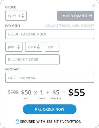
Once you select Pre-Order, the form only provides the most essential form fields for checkout. This is Miller’s Law at practice: the minimal amount of form fields for someone to provide payment. The form is also chunked into the groupings Quantity, Payment and Contact.
And what do you know, there’s a total of 7 form fields.
Bad Application of Miller’s Law
Check out Style.com. There are 9 top-level categories, but they seem disparate and thrown together randomly. We have seeming similar categories such as News, Community, and Magazine – which may potentially be chunked together.

Now compare that to Fashionista.com. Not perfect, but the 8 available categories they present already seem more logical and a cohesive whole than Style.com.

How to Remember Miller’s Law:
It’s hard to remember many things at once, especially if you’re drunk off Miller’s beer. (Inspired by Cesar Gomez’s use of “It’s Miller Time” from the Miller Lite commercials).
Bring it all together:
This blog post will be a fail if I ignored any of the principles myself. Instead of inundating you with dozens of smaller laws, these are the top 3 for UX Beginners to be knowledgeable about. To make these laws even easier to remember, here’s a ridiculous story that may help:
A country Hick has too many guns to choose from (death by choice). None of them Fitts his hands correctly; when he shoots, he often misses – especially small targets far away (target acquisition). Instead, he remembers that he’s better at drinking Miller beers (memorability). With some focus he can down 7 +/-2 bottles. No wonder he’s so chunky.
Nonsensical? Yes. But hopefully easier to remember.
YOU KNOW THE LAWS, NOW WHAT?
Ironically, a “law” is something that’s not supposed to change, like the law of gravity. But when applied to user experience design, the laws are secondary to the goals a particular product needs to achieve for both the business and its users. Under this context, the best solution is to apply user testing to see what works for the product and its audience.
1. Existing product
Design teams can analyze existing products through the lens of these three usability laws.
First, it always helps to have some baseline metrics to measure against. You get this by asking the questions: what are the intended user flows, and based on current designs, how are those user flows performing? Do you have a page element that you really want users to click on, but it’s driving low conversions compared to other parts of the page?
Based on what you find, you may apply one of the usability laws to increase conversions on a desired user path. For example, maybe only 3 out of 5 links on a page really matter. Perhaps remove 2 of the links and emphasize the more important link. This is a pedestrian example, but you get the point.
Make changes, then test the new design with real users. Even getting the opportunity to sit with 3 – 5 people and observing how they interact with your product is invaluable.

Tip: The relationship between laws and testing is a symbiotic one. Don’t know what you should test? Look to the 3 UX laws as solid starting points. Don’t know if a usability law is working with your design? Test it.
2. Creating new products/features
Whether it’s a completely new app or section to your website, this is a good chance to create an effective user experience from the beginning.
Designing with Hick’s and Miller’s Laws in mind, for example, help you create a design that allows the user more focus to complete tasks, and less superfluous options that lead to decision paralysis. Do you really need make your users input their age and location, or is just taking their emails enough? (Or perhaps you can collect some of this data automatically without form input).
Then, just as with existing products, you’d test your design with real users to identify qualitative findings (user confusion) or quantitative metrics such as the time it takes for a user to get to a certain part of your product.
Is your user spending more than a minute trying to read and understand your home page text? Maybe your findings lead you to find that the home page has too much copy, or that the copy itself is confusing. Tweak that.
Good UX design should be iterative, and ideally user testing is tied into the process to continually uncover insights.
ADDITIONAL READING FROM PEOPLE SMARTER THAN MYSELF:
- Balanced view of Miller’s Law [UX Myths Article]
- Fitts’ Law [Princeton Article]
- Balanced view of Fitts’ Law [Smashing Mag Article]
- Hicks Law [UX Myths Article]
Going in for an interview or networking event? If there’s an opportunity to talk about design and prove your UX background, sharing your knowledge of these UX laws (which, really, can be applied to many other facets of life) can help you establish credibility in the field.
If you’re interested in more “Impress Your Interview” posts, leave a comment below or sign up for UX Beginner’s newsletter below to email me – I want to know if these kind of posts add value to my readers.
Leave a Reply